
Making presentations more accessible
Presentations are a useful tool to convey key information while talking to an audiance either in person or at a distance (say a Zoom webinar or Teams meeting). Creating presentations with accessibility in mind helps all your audiance to engage with the content. This article details good practice to make presentations accessible.
Use built-in Accessibility CheckerUse accessible templates
Use easily readable text
Include alternative text for images
Ensure colour is not the only means of conveying information
Add meaningful hyperlinks
Use sufficient colour contrast
Give every slide a unique title
Create simple table structre for data only
Check reading order
Save your presentation in a different format
Delivering your presentation
Useful links
Use built-in Accessibility Checker
Go to Review > Check Accessibility to run the accessibility checker. This will highlight accessibility issues that the program was able to identify with recommended actions to resolve the issues.
If you do not have Check Accessibility under the Review tab, you can use File > Info > Check for Issues > Check Accessibility.

Use accessible templates
Download the University of Reading presentation template (login required).
You will notice that the background is not white. This is to help people with Irlen syndrome and other visual perceptual processing difficulties. This condition affects about half of the neuro-diverse population and about 15% of neuro-typical population. However, this may not help all people with disabilities and for some who are using coloured overlays on screens it could even interfere with thier preferred settings when viewing on computer screen. It is important to understand that there could be instances where you may have to engage with the person to discuss and provide a suitable solution.
Use easily readable text
Use a large enough font size (18pt or larger), sans serif fonts (such as Arial) and sufficient white space.
Use sentence case and not all capitals. There is more shape variation in using sentence case and this makes sentence case easier to read.
Left alined text is easier to read. Whereever this is appropriate, use left alined text.
Include alternative text for images
Alternative text helps people who are unable to see the screen to understand the content delivered by the image via the use of assistive technologies. If an image is used only for aesthetic perposes, the image should be marked as "decorative" so that the assistive technologies can ommit them.
Right click on the image and select "View Alt Text...". This will open the Alt Text pane where you can provide a short description about the image if it is an image conveying meaning. For example, if it is a graph you could mention what variables are in the axes and trends visible. If the image is for easthetic purposes, tick the checkbox "Mark as decorative".
Common mistakes
Don't use images of text unless they are a logo or similar. Remember to add alternative text for logos too. For example, for the University of Reading logo add "University of Reading" as the Alt text.

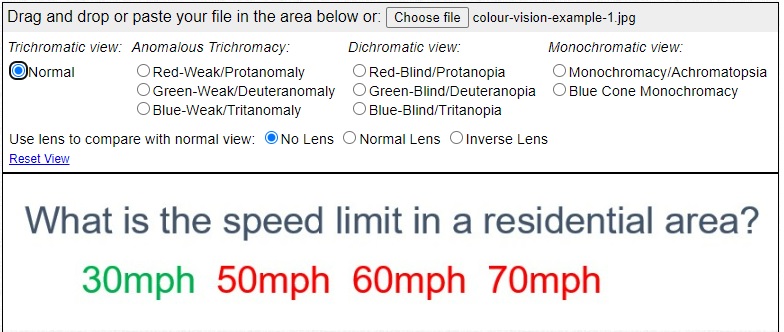
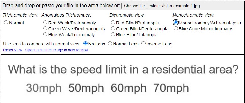
Ensure colour is not the only means of conveying information
People with colour vision deficiency have difficulty distinguishing between shades of red, yellow and green. The most common colour vision deficiency affects about 1 in 12 men and 1 in 200 women. Therefore, if you differentiate information only by colour, your audiance may not be able to understand the content. Coblis colour blindness simulator can give you a feeling of how it is to have a colour vision deficiency.
Example
This slide asks the question "What is the speed limit in a residential area?" with four possible answers.Correct answer is in green while distractors are in red.
This is how the same slide will be seen by a person with monochromacy colour vision deficiency. A person who is unable to distinguish the difference in colour will not be able to identify the correct answer.
Add meaningful hyperlinks
Avoid using link text such as "click here" or "See here", which does not give information about where the link will direct the reader. For example, if it is a link directing the user to the campus map, instead of "click here" as the link text use "campus map".
Use sufficient colour contrast
Good colour contrast between the background and foreground makes it easier to read content for people with vision impairements. In high or low lighting conditions, having sufficient colour contrast makes it easier for everyone.
Common mistakes
Make sure if images are used as background, there is sufficient contrast between background and foreground to be able to read any text. If there isn't sufficiet contrast, consider using "Shape fill" for the text area.
Example
 vs
vs 
Give every slide a unique title
Slide titles help people who are blind or have low vision, or a reading disability to navigate. Having a uniqe slide title can also help the reader to navigate to a specific slide they want if they want to revisit the content.
Common mistakes
Some people delete the slide title to get a blank slide when they want to fit in a lot of content or an image on to a slide. Instead, you can position the title off the slide. This way, the slide has a title (so accessible) and you have sufficient space for your content. For further information refer to the "Put a title on a slide, but make the title invisible" section of the Title a slide page.
Create simple table structre for data only
Use Insert > Table to create a table and then populate the data. Do not split or merge cells in a table or created nested tables as these present difficulties for assistive technologies.
Common mistakes
Do not screenshot tables from other sources and include in slides. The content of the screenshots cannot be read by assistive technologies and creates a barrier for accessibility.
Check reading order
If you have added extra items into a slide such as images or shapes the reading order of the slide may have been changed from the original settings. Reading order shows how assistive technology will read the content to thier user.
Review > Check Accessibility (open dropdown) > Reading Order Pane
Order the content so that a user who may not be able to view the slide can make sense of the content.
Save your presentation in a different format
If you are sharing a presenation, it is always more accessible to share it in the original format. Consider this before saving it in a different format to share.
Before saving a presentation into another format, run the Accessibility Checker and fix all reported issues.
Select File > Save As and under the file type dropdown select PDF(*.pdf). Then select Options. In the Options dialog tick the checkbox for "Document structure tags for accessibility" and select OK.
Common mistakes
If you select Print and then select the PDF option this will not be an accessible PDF.
Delivering your presentation
When delivering your presentation, you can use the Microsoft Office Online to provide automatic captioning.
Set up captions and subtitles
Follow the guidence provided by Microsoft Support on setting up captions and subtitles