
Accessible use of colour
Colour is used in webpages, documents, emails, charts, infographics and many other digital content. But is our use of colour accessible?
There are certain medical conditions and many external conditions that make it difficult for people to perceive colour. For example, in overlit areas (exposed to sunlight) or under-lit areas it is difficult to see content when the background and foreground contrast is not sufficient. On the other hand people with Irlen syndrome may have difficulty with black text on white backgrounds while people with colour vision deficiency may not be able to understand content differentiated by colour alone. There are several Web Content Accessibility Guidelines (WCAG) that address the issue of colour accessibility.
Use of colour
Making colour coded content accessible
Coblis Colour Blindness Simulator
Colour contrast
High and low colour contrast (demonstration)
Check colour contrast
Brand colours and contrast
Photo backgrounds
Competing accessibility challenges
Use of colour
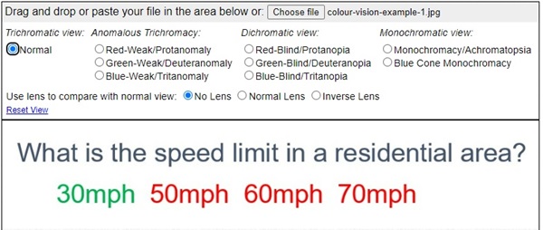
Colour should not be used as the only means to differentiate content. This is because people with colour vision deficiency may not be able to perceive content differentiated only by colour. Look at the example shown. Here, for the question "What is the speed limit in a residential area?", the correct answer (30mph) is indicated by green colour while the distractors (50mph, 60mph, and 70mph) are shown in red.
The same content could be "seen" differently by a person with a colour vision deficiency.
Expand to view how the same image could be "seen" by a person with monochromacy/achromatopsia
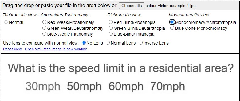
The information differentiated by colour is lost for that individual. This is why it is important not to just use colour to differentiate information. For example, you could use a * symbol to identify the correct answer.
Making colour coded content accessible
Now with this knowledge of the accessible use of colour, what do you think of colour coded content such as traffic light systems we often use in risk registers, status updates, etc.? Are these accessible?
Accessible traffic light system example
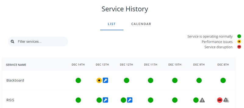
Digital Technology Services (DTS) uses a status board DTS Status Page. Notice how the colour and a symbol is used to differentiate different statuses making the status board more accessible.
Coblis Colour Blindness Simulator
Colour blindness simulator website
Use Coblis Colour Blindness Simulator to explore how various colour combinations are viewed by people with different conditions. Use the image provided or upload an image you wish to examine. Click on the radio buttons to simulate different conditions.
Colour contrast
Sufficient colour contrast between background and foreground is important to make content visible to everyone. Web Accessibility Perspectives: Colours with Good Contrast video shows why good colour contrast is essential for some and useful for all.
There are certain colour contrast levels (between background and foreground) that must be met under the WCAG 2.1 AA standards for accessibility
- Normal text 4.5:1
- Large text 3:1
- Non text user interface components and graphical objects 3:1
High and low colour contrast (demonstration)
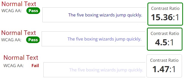
When there is sufficient colour contrast (that is at least 4.5:1 ratio between background and foreground) text is easier to read. When the contrast is low (for example, 1.47:1 as shown in the image), text is much harder to read.
Check colour contrast
Use WebAIM: Contrast Checker to find contrast between colours.
YouTube video Accessibility check the colour contrast provides a short tutorial on using the colour contrast checker.
Brand colours and contrast
Brand colours and contrast (Login required)
Photo backgrounds
Photos are used as backgrounds in many instances, especially in videos and presentations. If you are thinking of using background images, consider how accessible your text will be.
Is the text in this image visible? The poor colour contrast makes the text blend into the background making it very difficult to read.

The same image is used in the second instance, but with sufficient contrast to demonstrate the difference colour contrast can make.

Following these guidelines you can use colour accessibly in digital content you create ,making them accessible to the widest possible audiance.
Competing accessibility challenges
In general, people with autistic spectrum disorders prefer pastel colours. On the other hand, people with certain visual impairments require bright, high contrast colours to help them see content clearly. WCAG has considered these competing interests in formulating their guidance. However, it is important to understand that there could be instances where you may have to engage with the person to discuss and provide a suitable solution.